“Place” for mobile UX & design culture

Place is a deep concept rich in potential–particularly in relation to “mobile workstyles” and creating a culture of design. Indeed, my own fascination with “place” as an amorphous digital concept goes way back to a pivotal course at CMU taught by Malcolm McCullough on “Place-centric Design”–much of which served as fodder for his landmark book Digital Ground (which I highly recommend).

 —————————————————————

Does place still matter in the modern era of “mobile workstyles”?

As a UX community, “mobile first” has become the norm. From the consumers’ POV, who are now armed with multiple devices and web services, “going mobile” is a de facto expectation as well. What does this mean in the context of “mobile workstyles”, whereby workers can truly be untethered from their cubicle or office, and work from any device, at any time, and any where? How does this impact the notion of “place” for a mobile worker–the evolution of its value, utility, and general qualities? Does place truly matter any more?

Well, of course place matters, but in novel and challenging ways that we’re just beginning to scratch the surface, physically, experientially, and even socially. Place becomes more of a temporal, activity-based construct, contextual per informational and behavioral goals, not just physical implements. It’s emergent, not persistent. It’s dynamic, not static. It’s pervasive, yet uniquely shaped by individual and collective needs. It’s virtual and yet retains analog qualities of personality and communication.

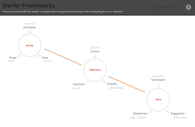
We need to explore such questions in the context of designing complex, interrelated cloud, social, mobile apps, enabling a “mobile workstyle revolution”–where people do their work anytime, any place, on any device. For example, what does it mean to access your files from anywhere, and share them (securely, of course) with anybody. Or interacting with your virtualized Windows 8 desktop (running legacy healthcare apps) on an iPad. Or holding video web conference call on your laptop, then move to the phone, while pulling in contextual information on your shifting presence and location? There are new models of information, interaction, and interface required. The technology landscape is changing swiftly, and our notions of “place” in this bold new world of “any-ness” demand critical re-interpretations of what’s productive and familiar to successfully design what’s next. Looking at the relationship among Activity + Experience + Value may pave a path forward…


 —————————————————————

Creating a place for design excellence: Culture, Process, Strategy, Leadership

When most folks think of enterprise software, images come to mind of confusing, complex apps that frustrate and annoy, built by tedious committees lacking empathy for their users. Alas, this is still true for much of the IT industry. However, four years ago, Citrix (a 24 yr old IT company founded in South Florida, of all places!) set on a path to break away from such stereotypes and revitalize their legacy IT products and culture through design.

Indeed, it’s interesting to note how Citrix has enabled a physical and cultural place for design-led innovation, starting with our hallmark 2,500 sq foot Design Studio–extremely rare for an enterprise software firm! As well as various “pop-up” studios across geographic locations, including UK and Bangalore. Every studio embodies rich cross-disciplinary activities, yet also a cultural attitude and approach for making user-driven change, grounded in principles (Simplicity, Empathy, Craft, Value) and habits (sketching, observing, interviewing, prototyping). For example, instead of engineering docs tossed to over the wall to designers to “make them pretty”, we advocate a “3 in the box” model with ongoing transparent collaboration. The studio has also become a conduit for creating a network of Design Catalysts, spreading design-based approaches amongst departments. Finally, it’s important to note the organizational places that design occupies within a 9,000 person global company, across tiers of design leadership: corporate executive (SVP), department director (Design Director, etc.), and individual contributor (Principal). Many humbling moments are often encountered–failure is expected! And it’s always a struggle to make change happen–you can’t “boil the ocean” but you gotta go where the suction is. These few essential elements (studio, catalysts, process, leadership levels) should offer hope to those leaders striving to create veritable place for design excellence within their own organizations, that’s more than just beanbags with MacBooks and fun toys ;-) 

Thresholds of design decision-making

Lately this word “threshold” has appeared in my readings and co-worker discussions. Threshold may be to be a very potent concept for designers to bear in mind. While principles serve as aspirational touchstones and lighthouses to guide a team towards what’s appropriate with deeply held values/goals, thresholds help with the reality of decision-making, gauging various levels of acceptable compromise.

A threshold is a kind of transition space, a crossing over (just like from room to room), from acceptable to not, risky to not, costly to not, failure to success, but with varying degrees of latitude along a continuum, not a strict binary either/or choice. It’s like a sliding scale for paying for a one-act theater performance, but how does one know what’s acceptable for a collective shared effort? And how is that point determined–through singular fiat or team vote? Thresholds help with choices, and design is all about making choices (or decisions). Sussing out the threshold for a team or project is not easy, but principles can help structure the overall conversational trajectory.

Thresholds appear when there’s that moment of uneasiness, awkwardness, or tension in the room about a decision, where it’s not obvious how to proceed, in terms of making the “right decision”. It’s very fascinating to see each stakeholder, via their own perspective and biases, brings their own level of thresholds (not to mention the actual threshold variables themselves): the Project Manager cares mostly about resource/scheduling, the Business Manager is focused about costs and markets, while Engineers are concerned with complexity, feasibility and risk, while UX looks at appropriate pleasure/pain levels for users, per user goals and contexts.

Often these are the types of issues that arise in project planning and design reviews that have a threshold factor:

– What’s the level of acceptability for…
– What’s risk/benefit in pursuing…
– What’s the level of pain users will tolerate…
– Are we getting enough value from this feature-add, what’s the acceptable cost…

Stakeholder maps (aka actors/ecology maps) and bullseye diagrams help as specific design methods for visualizing these conflicting tensions and anchoring conversations around such sensitive threshold moments. 

Again, there’s no one right decision or standard formula/prescription that can solve this. A threshold is not some magic number or found in a book. Arbitrary numeric scales, holding a “game” where each person has “tokens”, and so forth…such methods might help in the short-run. But each situation and question must be evaluated on their own merits, per shared or accepted values and principles. Thinking about thresholds might hold the key to a better compromise where the ideal state is unattainable, but with traversable difficulties.

Different kinds of design principles

Design principles are valuable in ascertaining & defining the core qualities of a product/service offering, providing a guide for critical decisions (and conflicts). I apply principles often in the course of my work, whether for a next-generation UI or a “design thinking” workshop for managers. Principles serve as the lighthouse and bedrock, guiding the team’s efforts toward an aspirational goal, while grounding everyone when conflicts and arguments flare up.

While reflecting upon design principles, I’ve looked upon a range which led me to identify at least four kinds of principles that function in various, subtle ways. Below is a brief breakdown with explanations and examples:

• Cultural: These principles are broadly phrased to serve as a collective touchstone for an organization with some shared purpose. They are meant to change team behaviors and attitudes for the better. They help frame interpersonal dynamics and project activity, and shape the language (or discourse) in a particular way. For example, at Citrix we have a set of five design principles that are not specific to a product or service model, but we advocate across the entire 9,000 person company, applicable to everyone from custodial services to executive c-suite, so as to create a culture of “design thinking”.

Screen Shot 2013 08 04 at 2 17 14 PM

• Systemic: These principles are a shade less cultural and more about creating a system of visual and experiential elements (like a brand system or GUI system) that has a specific voice, tone, ethos, and behavior that can be articulated with variations yet bound to a common creed, if you will. Great examples are UI standards and systems, in particular the Microsoft Windows 8 “Metro” (former name) system with its boldly stated principles that define and unite the “Metro” look and behavior, regardless of platform implementation (tablet, phone, laptop, video game unit, etc.).

Screen Shot 2013 08 04 at 2 17 34 PM
• Tactical: These principles guide “in the trenches” decisions about design elements in the creation of a useful, attractive product. This is tangible impact level, with specific outcomes in terms of an actual design: placement, alignment, structure, motion, sequence and frequency, etc. Two of the best examples are Bill Scott’s principles for rich web application design and Edward Tufte’s principles for “envisioning information” (which are laid out directly on the book’s cover). Far from abstract theory, these guide pixel-level design details with immediate tangible outcomes.

Tumblr md54jxUUPT1rzteako1 1280


Envisioning information front large• Legendary: Finally, these principles I somewhat cheekily refer to as “legendary” because they have arisen from certain “masters of design” who’s lifelong repertoire of work & experience led to certain powerful, time-tested insights that elevate to legendary status. Almost unquestioned, they are taken as fiat, definitive and authoritative in their historical import and impact. The best example is of course the 10 Principles for Good Design by Dieter Rams, a reflection of his sternly modernist ethos that he successfully executed while at Braun (and elsewhere). Frank Lloyd Wright, the Eameses, Le Corbusier, Paul Rand, Massimo Vignelli, and other notables also echo principles of such caliber.

Poster
However, just because such principles are conveyed by an historical “master of design” doesn’t mean that they are necessarily always relevant or appropriate for your project. We must all be wary of turning principles into platitudes, thrown about carelessly as pithy erudite quotes simply because someone said so–and it got re-tweeted by everyone including your uncle!

A principle bears relevance when it arises out of tough inward-oriented conversations and intense self-scrutiny about the motive, intention, and purpose of the project. Context and people’s values are essential ingredients when stewing on sensible principles that will elevate your quality and goals. Healthy skepticism and critical eye/mind are vital to avoid the wayward seduction of pithy popular erudition.

• One more thing: Hybrid Principles! And of course there are some principles are a blend of the aforesaid types, impacting levels of culture, team, project, and product in various ways. At Citrix we have a set of Product UI Standards (formerly known as “Symphony”) which has systemic overtones like Metro but also specific tactical principles to guide design and dev in their implementation. This is written about nicely here by Citrix colleagues on UX Magazine.

Preparing to improvise

Recently I had the very cool opportunity of demo’ing some critical UI concepts to our company CEO (with assorted execs), as well as to high profile customers seeking a multi-million dollar product deal. Whew! No pressure, right?? Some fairly intense situations, no doubt. While the outcomes were gratefully very positive, with ample feedback for future iterations, I wanted to reflect upon some valuable lessons learned.

The primary lesson for me: that when preparing for a product demo you must be ready to improvise on the fly, not only because of technical snafus (which are inevitable, to varying degrees of severity), but also for audience reactions and skeptical questions. Remember, they are seeing the concept for the first time; you’ve been living it for weeks or months. Thus, to improvise really well, you need to prepare extremely well, in advance, with total thoroughness. 

What do I mean? Let’s break it down a bit…


** When it comes to demo preparation, you gotta focus on the following:

– Master the exact narrative and functional sequence of the product demo, committing it to memory both verbally and physically. Knowing what to click and what happens next. This is absolutely fundamental, period.
– Rehearse the flow across multiple devices, platforms and browsers (as needed), and doing that in the exact room to be used in the exact location as well (front, back, etc.)
– Mirror exact environmental conditions as much as possible (lighting, sound, crowd level, video camera positioning, etc.). And don’t forget WiFi conditions too (or whatever internet and wireless tech). Set up all that in advance, and bring adapters, chargers, cables, etc.
– Prepare to give the main rationale for WHY (particularly in the case of executive/CEO demo feedback). Be ready to articulate the design decisions and abbreviated history of that decision, if possible. I often use stickies to help me abbreviate and commit to memory: Keep it Short & Simple.
– Dig up recent alternative designs, concepts, sketches and have that ready on a separate computer, iPad, printouts, etc. This requires presence of mind to recall that you have these ready if audience asks!


** When it comes to improvisation readiness, prepare for the following possibilities:

– Not immediately understanding the concept itself. Have several analogies and metaphors ready in mind that are commonplace, non-technical. Shift from professional demo speak, to folksy “aw shucks” manner which helps break most barriers.
– Deep skepticism about the concept’s relevance and value. Have use cases and stories ready to mention, and relate stories back to the audience! Ask them their similar problems that your concept could fix.
– Mix up your presentation with references to the weather, names of the customers in the audience, any small talk prior to the demo (like a customer’s kid is having a baseball game tonight) to add that special relationship touch.
– If devices and services break with technical snafus, do NOT apologize but instead keep vamping it! Keep a sketchbook or whiteboard handy to illustrate the concept in real-time.
– Always be ready to throw questions and discussions back to the audience (just like in improv games) to positively engage them, enabling a dialogue rather than a tense inquisition.
– If you’re really brave, ask audience to play with the demo or suggest “what shall I click on next” :-) But only if you’ve really got things working!

Through this mix of technical preparation and savvy improvisation, you’ll be able to deliver memorable and useful product concept demos. It definitely takes much practice and some luck too. Don’t forget to make the appropriate pleas & sacrifices to the demo gods beforehand!

Designers and their tools

Earlier this year there was outrage and grief expressed over Adobe’s decision to no longer continue development for Fireworks. It is, in effect, being killed off. As a dedicated Fireworks user since 2006, I’m just as disappointed. For me, at least, it was a valuable design tool that let me express very quickly with high quality novel UI concepts at a high degree of fidelity, with basic prototyping support. Sure it’s buggy, fraught all kinds of issues (like inconsistent icons and kludgy interactions), but the speed and quality of output is compelling. Fireworks almost instantly became the predominant tool in my arsenal for crafting great interfaces.

Now with the end of Fireworks announced, many are wondering which tool will take its place. Many tools abound, including Sketch (which seems to be the primary front-runner as of this writing) and Photoshop, of course.

But I’m not interested in debating which tool will ascend to the Iron Throne of UI design ;-) Instead, this whole situation got me wondering about what it means to use a digital tool, that tool’s relationship to its user…as well as how such a powerful tool shapes one’s identity. Let me explain…

A digital tool like Fireworks is a mechanism for executing an idea, translating a person’s vision emerging from their mind into something tangible that others can use and evaluate. Different tools have different purposes (like a hammer or drill) but digital software tools in particular are like Swiss Army knives, loaded with diversely segmented yet thematically related functionality. The master of such a tool is really someone who has practiced extensively using that tool in a variety of ways (and variety of situations) such that it becomes an extension of their mind, eye, and hand. A true virtuoso of that tool (or toolset) can already anticipate the choreography of when and how to use which tools or features for specific tactical problems. That tool becomes a means of foresight and judgment before the fact, almost predictive in its potential for the kinds of outputs that can and should be generated. (Think of a master of Fireworks or Photoshop or even Powerpoint, fluidly navigating and expertly executing, in an also pre-cognitive manner)

In so doing, the tool and its user forge a personal bond, much like a baseball player and his mitt or a carpenter and his special hammer. There’s intense familiarity, trust, acceptance of flaws, workarounds formed, and yes dedication to maintenance, preparing the tool for the next day’s work. (Not that there’s much love in using that damn Adobe updater to keep things running smoothly!) Just like a carpenter knows his tools, where they live, and their thresholds of capability, a designer knows how their software tools function best, personalizing the workspace of palettes and menus for what’s most comfortable and effective to finish the job.

This intimate relationship between tool and user is quite potent. But does it define the user, their sense of self? Does the tool make/break the user’s identity? If that tool breaks or no longer becomes useful, some sentimental value is lost, with personal grief over disposal of an old friend. But the tool’s user continues onward with other tools or stronger & better replacements, rebuilding a new relationship. He is still shaping visions and deftly applying his skills in executing and delivering per values and principles: quality, integrity, trust, etc. I’d suggest that tools do not make the practitioner. You are not your tool, no matter how dedicated and intuitively bound the relationship.

This is particularly relevant to designers as modern software tools change constantly, with emerging technologies, brands, companies, and user communities all in flux. Every few years (or months!) something new comes along that’s deemed trendy and useful (Flash > MS Blend > HTML 5 > Native mobile SDK > etc.) The tools do not make or break the designer who must constantly stay flexible, learning and applying and swiftly adapting as situations change. To say you are a Fireworks designer or Photoshop designer would be extremely limiting in a volatile industry where some hot new tool or technology surfaces every few months or couple years. Tools can be ephemeral yet require a deep intense bond for flawless high performance utility. It’s this balance that’s important to maintain and incredibly hard to do so, as no doubt more tools will fade away as new ones appear on the horizon. Tools are essential and powerful ways to deliver results, but just don’t get too wrapped up in them. Even if it’s something like Fireworks.