MS Project != design happiness

I was having lunch today with a former Adobe design manager at House of Kabobs in Sunnyvale (I highly recommend it!) and we wandered onto the topic of UI schedules and MS Project in particular. I’m just not a fan of MS Project: it’s bloated, ugly, tedious, heavy, bespeaks of micromanagement and bureaucracy (death by Powerpoint? how about waterboarding by Project!). But there’s something else irksome about it and until today I just didn’t know how to express it. But my friend said it just right: “MS Project is meant for deterministic projects, where you already know the result.” He’s right–If you already know what you’re going to build, then it’s just a matter of “construction”, getting the materials and resources and time to build the damn thing. And all that can be neatly, tidily inputted in and calculated out to the Nth degree.

But here’s the rub–design is fundamentally indeterminate! Meaning, there is no pre-determined outcome, there’s instead innovation, and ideation and hypothesizing, and fast-failing and iteration, and of course exploration of the boundaries and scopes/limits. (with the possibility of negotiating those limits) For instance, if you pre-determine yourself to make a 4-sided widget to be built as the “UI solution” and it turns out a 5-sided widget is better for whatever design rationale, you’ve cornered yourself in with an MS Project dictated schedule based upon that 4-sided widget. Now you have to re-work the schedule to fit in the new design, resourcing, materials, testing, etc. And in any multi-disciplinary context, that usually involves committees, approvals, etc. By the time it’s all done, you could have designed a few alternatives!!

So, I’m sure MS Project is great if you already know what you’re going to build. But if you don’t know and have yet to go thru the design process, I don’t believe MS Project is the way to go. The creative/iterative process is simply too organic and messy for something that is inherently stilted and over-structured to the point of being formulaic. MS Project was built for number-crunchers, not designers.

The value of a designer

Just in case there’s any doubt :-)

The designer adds something important that technical experts may neglect—the ability to bring grace and elegance into forms and devices that are humanly engaging, often exciting and sometimes unexpected. Designers add marvel, and that can make a product more deeply usable, reaching beyond the prosaic or pedestrian.

— Dick Buchanan, Good Design in the Digital Age

Update: Jamin Hegeman, MDes 2008, posted recent thoughts by Buchanan on this topic here: http://jamin.org/archives/2006/why-designers-are-valued/

Part 2: Interpretations of beauty as a value of user experience

[Second in a series of postings about aesthetics and beauty as they pertain to interaction design, and beyond…]


When we think of beauty, certain things come to mind: art, nature, physical and sensual qualities of the human body. But what about the artificial or digital, those interfaces/services/systems that are conceived and planned and designed by multi-disciplinary teams? Is it sensible for a digital UI or consumer product to be characterized as beautiful in the same way as a painting or a flower? Doesn’t that depend upon the relation between the user and the value of the user’s interaction (i.e., experience)? Indeed, how should one articulate beauty in terms of design, supportive of technology and business aims, driving new product development enriched with this sense of beauty, or aesthetic imperative? This hints at the broader issue of interpreting beauty as a matter of user experience.

But what is meant by experience?

I propose that experience involves a subjectively interpreted, continuous stream of psychological and physical phenomena brought into awareness through an interaction or communication. This depends upon the following elements:

• The relationship between a person and an object
• The process of being drawn to that object and engaged on multiple levels: physical, behavioral, and emotional
• The value that arises from the attractive encounter

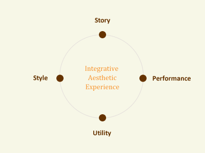
These elements may be labeled as attention, attraction, and beauty. So beauty—an emergent value of human attention and emotional attraction—enables designers to plan and craft products that offer a rewarding, memorable encounter.

I offer a framework to provide ways to understand beauty as an experiential phenomenon, arising from user/product interactions. What follows is a set of interpretations of beauty based upon the writings of John Dewey, Mihalyi Cziksentmihalyi, David Gelernter, and Walter Gropius (philosophy, psychology, computer science, and architecture, respectively).

beauty_model.png


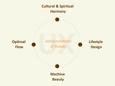
This model is a tool to guide discussions for interaction designers about a product’s aesthetic value, centered upon user experience thinking. This is not a statement of a grand unified theory for all beauty or aesthetics in nature, but only focused on “the artificial” or human-made artifacts. Please note that no one interpretation is preferred, nor are they exclusive of one another in evaluating a product as “beautiful”. It’s not about being “right” or “wrong” or “better” or “worse”…It’s about expanding our vocabulary and ways of looking at the problem of beauty in terms of interaction and experience.


Optimal Flow

Csikszentmihalyi is a psychologist who regards human-product interactions as a pathway to personal achievement amid daily concerns for speed, efficiency, and materialism, which may engender a disconnected way of life. His theory of optimal experience—or flow—is predicated upon self-directed efforts to focus one’s attention. This concern for attention suggests useful design possibilities. Using Csikszentmihalyi’s language and approach, one may consider designed artifacts as systems of interaction, whereby the invitation to participate evokes a harmonizing response. The artifact expresses its “rules of engagement” of how to approach and use an object through its form, all directly perceived by one’s attention. Such rules may include the visual semantics and product affordances that convey a manner of use. Thus, these rules shape the experience, or attractive relationship, between the user and artifact. The user subsequently enters a process of participation in which flow conditions may emerge, if there is a suitable matching of goals, skills, and feedback for the user. The proper balance enhances the utility, usability, and desirability of the product overall.

Lifestyle Design

John Dewey was a pragmatist philosopher focused on the process of interaction between a conscious being and her environment—the “sustaining or frustrating” conditions that define the activities of a person, such as the tools, spaces, materials, or other people. Dewey shifted the emphasis of interaction from a reflexive communicative exchange—such as flow—towards an outward relationship of growth and renewal. Every experience has a structure and pattern, found in a rhythmic “doing and undergoing”. Dewey was especially concerned with recovering aesthetic experiences, which feature a dynamic integration of thought, action, and emotion into a unifying whole, that he termed “an experience”. Dewey avoided the term beauty due to its Romantic origins, but he pursued what may be construed as experiential beauty—a harmonious balance of the maker’s intent and the perceiver’s expectations towards a meaningful consummation of movement of emotion from inception, carried through development, and ending with an artifact that lives in experience.

Machine Beauty

For computer scientist David Gelernter, “machine beauty”—the union ofpower and simplicity in innovation—is key to developing products that helps users “break free” from the confines of a machine’s internal logic towards a “creative symbiosis” between the user and her activity. In other words, the device should be an extension of a user’s intention to accomplish a task, like stapling papers, dialing a phone, washing clothes. A loss of awareness of the structure and mechanics results, leading to a direct engagement of the material, akin to Cziksentmihalyi’s “illusion of disembodiment” and a singular unity of being. However, such beauty does not live in the environment of one’s lifestyle or absorbing one’s attention but in the execution of the logic of the product’s functions in relation to a user’s activities. Does the product enable her to perform her task, so that it does not become the burden her attention? To achieve functional elegance, there needs to be a transparency of use and directness of effect, turning the product and ensuing experience into something simple yet empowering.

Spirital & Cultural Harmony

Finally, the fourth interpretation of beauty takes a holistic look at the relationship between a user and her product and how that impacts personal beliefs, cultural values, and even a sense of “spirit”. This is drawn from Walter Gropius’ idea of a “scope of total architecture”. Gropius, was the influential founder of the Bauhaus, based upon principles of integrating art and design, to inspire industry with clean, rational forms. Gropius described his vision of design planning as “the art of coordinating human activities towards a cultural synthesis,” a reunification of the self with the natural environment, beyond the perils of mechanization. Amid the “atomizing effects” of an increasingly mechanized society, there is a segmentation of human lives. Therefore, Gropius’ approach sought to achieve balance, order, and unity within one’s life, collectively and personally. There is an internal movement that connects a person to something greater than herself, perhaps ideals that speak of a cultural synthesis. She may feel like a member of a community that elevates what has been experienced into something personally intimate yet outwardly relating to a collective whole. To design products that inspire the human spirit and awaken cultural connectedness is a powerful variation of experiential beauty.


Aesthetics for Interaction Design

Part 1: General thoughts on design aesthetics

Part 2: Interpretations of beauty as a value of user experience

Part 3: Towards an integrative aesthetic experience

Part 3: Towards an integrative aesthetic experience

[Third in a series of postings about aesthetics and beauty as they pertain to interaction design, and beyond…]


So what then is the result of this investigation into beauty, as a value of user experience and beyond? In terms of pragmatic product development, where the designer must collaborate and communicate with non-design peers leery of “flowery prose” extolling beauty’s worth (“What else is new”, yawns the jaded engineer), what’s needed is a simple yet powerful framework that builds upon what we already know. This framework must provide a straight-forward vocabulary and un-compromising attitude about what’s most important.

What’s also needed is a re-positioning of beauty from simply surface veneer towards a cumulative or “integrative” aesthetic whereby the core elements build upon each other to yield something engaging, memorable, and thus deserving of repeat purchase or glowing customer testimonials. Aesthetic implies a totality, a whole, that also speaks to the whole human being, not just “users” objectified for a study or reduced to a data point: issues of respect, desire, freedom, interaction, etc.

I propose a movement towards creating and delivering the “integrative aesthetic experience”, as a way to target product development efforts around human goals that will lead to better products, happier customers, and increased business, etc. This idea is based upon the following framework:

iax_model.png


These are the core elements of an aesthetic experience expressed in simple practical terms that can be used with PM’s, engineers, managers, but keen readers will note their mapping to Classical rhetorical terms that constitute the balance. The following is a breakdown of each element with the Classical term in parens.

Story (mythos): The narrative or scenario of use for this product, and how it suggests a positive, beneficial user experience or service for the targeted customer. Also, how does this offering fit within the portfolio of products/services by the company. What’s literally “the story” for this, as communicated by marketing and supported by the product’s functionality, to fit the user’s needs and goals?

Style (ethos): The sensual/visual voice expressing quality of the product, and the overall brand in a way that supports the business, distinctly portrays the product, and fits the user’s “gestalt” of the company, context of use, needs/wants. High style is valued by today’s customers for various psych and emotive reasons.

Performance (logos): The technical ability of the product; its functionality and durability for the targeted market and usage scenarios. High performance, anytime/anywhere, 99.9999 uptime, rapid updates and on-the-fly responsiveness all convey this quality.

Utility (pathos): The general usability and utility of the product’s features for a specific audience and context. Is it ergonomic, culturally appropriate, psychologically meaningful. Are the affordances easily conveyed? Is it accessible and standards-compliant, etc.

With these simple terms a product development team can:

– Map core elements that relate to their team function and role (for example, Engineering & QA in charge of performance, Marketing shapes the brand story, User Experience guides the style and utility).

– Shape a meaningful dialogue about the product around specific anchors, instead of loosy-goosey vague wording and hand-waving, there’s something specific to point to and someone can take ownership of (for example, Does the story enhance the overall company brand? Who can improve that? etc.)

– Establish basic criteria for internal evaluation, a 1-10 rating perhaps for determining go/no-go decisions, judged according to each of the four elements (for example: story is a solid 10 but the performance is meager 5, while the style is only a 2, etc.)

I think what makes this framework powerful is its use of simple clear words anyone can grok fairy reasonably and easily. Managers and engineers “get” what style, performance, and utility are all about. PM’s often argue about “what’s the story” for a certain feature when preparing their PRD or MRD requirements. These are not alien terms or “flowery prose” but ordinary concepts that map to something quite extraordinary and powerful for the designer seeking to achieve beauty in design, regardless of the final form: an interface, a device, a service, etc.

Aesthetics for Interaction Design

Part 1: General thoughts on design aesthetics

Part 2: Interpretations of beauty as a value of user experience

Part 3: Towards an integrative aesthetic experience

Where’s… the spec?

(To be said in the same tone as the classic Wendy’s television ad tagline, “Where’s the beef?”)

It is inevitable for UI designers to be confronted with the question, “where’s the spec?”, usually posed by the product manager (PM) or engineer/QA leads. I’ve faced this at every in-house software design scenario to date, including Oracle, BEA, and Adobe. But this posting is not a gripe about specs per se. Specs are vital documents that provide detailed textual & visual instructions to enable the accurate implementation of a design solution (and for QA test cases). Specs are critical recipes for engineers to know exactly what to build and how it should behave in accordance with the proposed design solution. Specs make explicit the solution that often lives in the mind of the designer (or plethora of emails and sketches on file servers).

But what irks me is that inevitable question and what it signifies, when you think about it deeply–that engineers are seemingly and perpetually in a state of code production, cranking out the latest build, finalizing for ship (or “golden master”). Hence, their desperate need for the “UI spec” that outlines every iota of detail to the Nth degree of tedium and exhaustiveness…So that the engineers can build it, ship it, and start on the next release. Sigh!

[This is totally resultant of the problem Alan Cooper smartly explains in About Face, whereby design and engineering are happening simultaneously or worse, design is behind coding. Ideally, design should and must operate ahead of coding…way the hell ahead!]

This question (and that constant need for a “UI spec”) implies that the product development process is fundamentally flawed: its focus on the recipe document as opposed to the optimal design solution to be specified in the first place. As a presidential candidate remarked earlier this year, “I’m in the solutions business”; likewise, so am I. My focus (and the job responsibility for which I’m paid lots of money) is to create and deliver the optimal design solution for a targeted user audience. This task requires multi-disciplinary cooperation, rounds of creative exploration and technical investigation, iterative prototypes (or mock-ups), user feedback, and then an unambiguous review and sign-off process with key stakeholders.

There needs to be a fundamental shift in product development players’ mindset away from constantly demanding (and expecting) a complete spec (which in itself suggests a “throw it over the wall” mentality, just give me what you got, whatever it is and we’ll build it) towards shaping a collaborative blueprint. A blueprint implies a conversational document that will be amended as constraints are addressed or technical novelties discovered (or user feedback validated). It’s an evolving document. It implies shared commitment and purpose, taking in inputs from engineering and marketing but owned and defined by the designer. Qualities that I think are far more valuable than the best written (but potentially incorrect) UI spec thrown over the wall to the eager yet uninformed engineering team, desperate to keep to their coding schedule.